Monday, October 19, 2015
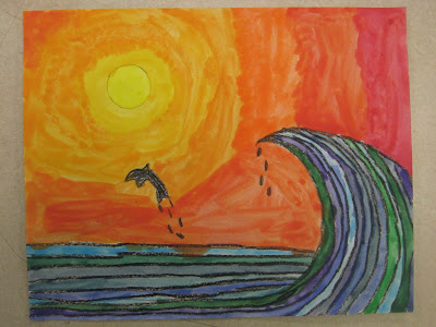
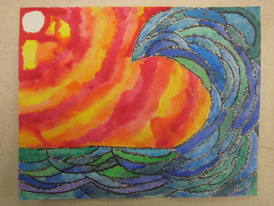
6th Grade Ocean Paintings with Contrasting Colors
I have posted about this lesson before, but I was really pleased with this year's results, so I'm going to share it again! It is inspired by the artwork of artist and surfboard designer Drew Brophy. The students learned how warm colors and cool colors contrast. After drawing their ocean with black crayon, the students spent one day working in cool colors, and one day working in warm colors. For cool colors, they got light blue, dark blue, green, and purple, and were able to mix them any way they liked. I encouraged experimenting; if they made a color they didn't like, they didn't have to use it! The paints were watered-down tempera paints (to give a watercolor effect; I might use liquid watercolors for this lesson in the future! But, this method is sooo cost efficient). Each table got a small cup of each color, and each student got a paint tray for mixing. They poured small amounts of each color into the paint tray and mixed however they liked. The students learned that any time you mix two (or more!) cool colors together, the result is always a cool color. The following week, the same paints and concepts were used with warm colors, red, yellow, and orange.
Subscribe to:
Post Comments (Atom)


I think these are excellent!
ReplyDeleteLove them!
ReplyDelete