Tuesday, October 27, 2015

Line, Pattern, and Color with 5th Grade

Sometimes when I'm browsing the internet, I'll find a really inspiring contemporary artist. I recently discovered an artist named Colleen Wilcox, from Hawaii! Her seahorse painting and octopus painting especially inspired me.

So, I shared her artwork with my 5th grade students (sometimes it's more meaningful to them to see a modern-day artist instead of an historical artist from a long time ago).

Then, the students created their own undersea artwork, focusing on line, color, and pattern. They first drew their ocean scene with crayons, and later painted with watercolors. I asked them to only make lines with their crayons, and to fill shapes in with paint, instead of coloring.

Here are some results from my 5th grade students.


Below are the paintings from Colleen Wilcox that I showed the students. But, I encourage you to visit her website, and browse her other work!


Tuesday, October 20, 2015

3rd and 4th Grade Parrots

My 3rd and 4th grade students recently learned about artist John James Audubon's bird studies. If a bird had variations within its species, he would draw the bird multiple times to show the differences. For example, his cardinal artwork shows both the male and female, as they are different colors.

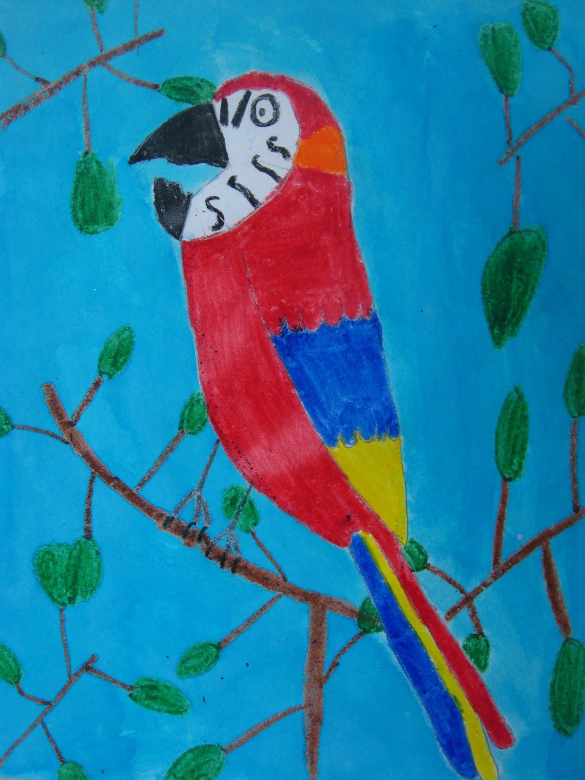
We looked at many different parrots before drawing ours, just like Audubon studied many of his birds. After seeing several different parrots, we made a list of the colors we saw. Then, we started drawing the parrot based on one photograph. But, as we got to each detail (the face; the feet; the tail), we looked at a different parrot to see more details. Lastly, the students colored their bird however they liked, using our list of parrot colors for reference.

In this lesson, the students worked from many photographs instead of just one. This was a positive experience, because when students were upset that their parrot was too fat; had too small of a beak; didn't have a long enough tail; etc., I was able to point out that some parrots look that way! This drawing method helped the students stay positive. (Usually it's my most talented students that are most critical of their artwork, so when someone is concerned their work isn't "right" or isn't "good enough", they usually need positive feedback, not correction in their drawing skills.)

The artwork was sketched in pencil, colored in crayon, and the background was painted with blue liquid watercolors.


Monday, October 19, 2015

6th Grade Ocean Paintings with Contrasting Colors

I have posted about this lesson before, but I was really pleased with this year's results, so I'm going to share it again! It is inspired by the artwork of artist and surfboard designer Drew Brophy. The students learned how warm colors and cool colors contrast. After drawing their ocean with black crayon, the students spent one day working in cool colors, and one day working in warm colors. For cool colors, they got light blue, dark blue, green, and purple, and were able to mix them any way they liked. I encouraged experimenting; if they made a color they didn't like, they didn't have to use it! The paints were watered-down tempera paints (to give a watercolor effect; I might use liquid watercolors for this lesson in the future! But, this method is sooo cost efficient). Each table got a small cup of each color, and each student got a paint tray for mixing. They poured small amounts of each color into the paint tray and mixed however they liked. The students learned that any time you mix two (or more!) cool colors together, the result is always a cool color. The following week, the same paints and concepts were used with warm colors, red, yellow, and orange.