For the past year and half, my erasers and pencils would constantly go missing. My students rarely take things intentionally, but they often forget if the pencil in their hand is theirs or one they borrowed. I lost so many pencils and erasers this year that I even bought some myself (and when I spend money on my job, I like it to be for something special for my students, not basic supplies!). Finally, I started writing "Miss Young" and "Art" on all of my pencils and erasers. At last my eraser bin and pencil cup are staying full! Several times a week, I'll even have a student come to return something they found in their art box that they had taken by mistake. If they see my name on something among their own things, they bring it back! I haven't had to refill my pencil cup for several weeks now.
Thursday, March 21, 2013
Wednesday, March 20, 2013
5th Grade Learns About Picasso (and Draws Tootsie Rolls!)
Several months ago, my 5th graders studied the art of still life artist Pieter Claesz. Claesz's art practically resembles photographs! After seeing his art, they drew their own still life of vases (which I blogged about last year here and here).
This year, after completing still life drawings in September, I decided to revisit the topic of still lifes, with a new spin. I showed the students Pieter Claesz's still life painting, and asked them if anyone remembered who it was by. Thankfully, several students did remember his name! Even the students who didn't remember his name remembered some things I mentioned about Claesz's technique.
After reviewing Claesz's art, I showed a still life by Picasso. I asked the students if anyone thought it was more realistic than Pieter Claesz's still life. Of course several class clowns raised their hands to say they thought it was much more realistic. After everyone laughed a bit, I told them that actually, many people think that it is much more realistic. Claesz's art looks like a photograph. But, is a photograph real? No, a photograph is just a flat page. If you look at it from the side, you can tell it's nothing but a picture! Picasso didn't want to portray just one view of his still life; he showed many different angles at once! He didn't want his painting to just look photo-realistic; he wanted to show the whole essence of the still life; the sides, the front, the top, the bottom, even the inside of the vase (which is why the opening of the vase looks like a circle. When the 5th graders had drawn their own still life of vases months ago, we spent some time discussing how the opening to a vase looks like an oval from the side, and only looks like a circle when you are standing directly above it, looking in). Thus, by showing the whole object, instead of just one angle, Picasso's still life is, in a sense, more realistic than Claesz's.
Thankfully, my students really understood the concept! I pointed out different parts of the painting, and asked them where he might have been standing as he painted that part. Clearly Picasso had looked at both sides, the top, and even under the table! I could tell some of my students were blown away by Picasso's genius, which really made my day.
Next, I asked the students if they wanted to see a person painted by Picasso in Cubism (which I had already explained was the style that Picasso had painted in). The students were very eager to see such a thing, so I showed them a portrait by Picasso, which showed the side view of an eye, both sides of the nose put together, ears pointing different directions, etc.
Next, we discussed how Picasso could only paint in the Cubist style after he had already mastered painting with photo-realism. I showed them a self-portrait that he had painted at age 15 to prove his talent.
And lastly, the students each drew a Tootsie roll from three different angles. I told them that if Picasso were drawing a Tootsie roll, he would show all of the sides, not just the front. The end looks one way; the side looks another way; if the Tootsie roll is turned slightly so both the end and the side shows, it looks different again! If they drew the Tootsie roll well enough, they got to eat it. (We're getting close enough to the end of the school year that bribing my students is sometimes necessary to get quality art out of them!)
Here are some of their drawings:
Tuesday, March 19, 2013
4th Grade Undersea Art
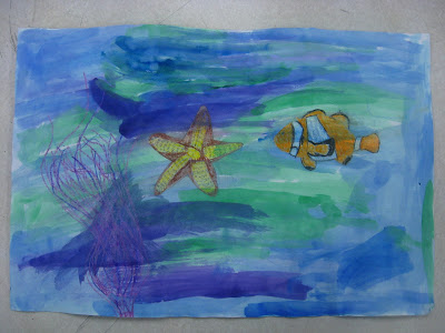
Last year, I taught a lesson on Wyland's murals of undersea creatures, especially whales. Then, the students created large crayon resist pictures of an undersea scene. My students did a great job on the project, and seemed to really connect with Wyland's art. So, this year I taught the lesson again! It sure is nice to have a year of teaching done; lesson planning will probably be much quicker once I have 10 or 20 years of experience. But, if I repeat lessons too often, my blog will probably get boring! Here are results from this year:
Friday, March 8, 2013
Recycling
Here are 100 maple syrup jars washed and ready to be painted as bud flower vases for Mother's Day by my second graders in a few weeks. I guess my part-time job as a waitress at Cracker Barrel pays off in more ways than just covering the bills my teacher salary doesn't cover! I haven't decided what type of paint to use on them yet, but I've heard that Folk Art enamel works well on glass. Has anyone used that, or have a suggestion on another affordable paint to use on glass? Also, I haven't decided yet if I am going to try to get real flowers for the students, or if I will have the kids make flowers. Any suggestions on a cheap way to get 100 small flowers, or a nice way to make them? I'm considering tissue paper flowers on green pipe cleaners, or asking the flower shop in town if they have any leftovers they could donate.
Thursday, March 7, 2013
Clay Picture Frames with 5th Grade
My 5th grade students have been working in clay, making picture frames from slabs. The students began by making a paper template (tracing the edge of their photo on a paper, and measuring straight, even edges all the way around). Then, the students places their template on a slab of clay that they had rolled, and traced the shape of the frame with a needle tool. Next, they used carving tools to carve designs, or they added designs, taking care to score and slip between pieces. Finally, after they had been bisque fired, the students glazed them however they wanted! These have been a long time coming; one class finished before Christmas, two classes finished in January, and the last class just finished a few weeks ago! Thus, there are frames that say "2012" on them, and there's a Christmas-themed one.
To finish the frames, the students taped their school photo into it, and we glued a cardboard back over that. Then, a folded triangle was hot-glued on to make a stand. The photo in the frame is not interchangeable this way (it would have taken a lot more time to make a back that opens!), but I told the students that it was good to always have their 5th grade school picture in the frame that they made in 5th grade. A few students' families did not order school photos, so for them, I printed their photos from their file on Harmony, and had it laminated. Not as nice as a real photo, but close enough!
To finish the frames, the students taped their school photo into it, and we glued a cardboard back over that. Then, a folded triangle was hot-glued on to make a stand. The photo in the frame is not interchangeable this way (it would have taken a lot more time to make a back that opens!), but I told the students that it was good to always have their 5th grade school picture in the frame that they made in 5th grade. A few students' families did not order school photos, so for them, I printed their photos from their file on Harmony, and had it laminated. Not as nice as a real photo, but close enough!
Tuesday, March 5, 2013
1st Grade Texture Planets
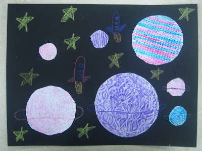
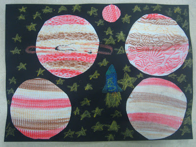
My 1st grade students are learning about texture right now. We used texture rubbing plates to rub different patterns with crayons. The students began by tracing round objects on a white paper to make circles. Then, they placed different texture plates under their paper, and colored inside the circles. Lastly, they cut the circles out and glued them on a black paper. Finished pictures were decorated with construction paper crayons. I showed the students how to make a ring around a planet, how to draw stars, and how to make a space ship.
Subscribe to:
Comments (Atom)


